Note - this post was done before my work at EL Education, where Quarto and R are utilized not just for analysis, but for communication as well. Future posts will center code blocks and be easier for others to work with.
Problem: Do STEM teachers across disciplines within a fellowship program get the opportunity to meet through the courses they take? (Part 2)
Data:
The data provided to explore this problem was course enrollment data, specifically looking at the enrollment within courses with multiple workshops over the course of a semester.
Solution and Code
I walked through the Solution to this problem a month ago, but I wanted to return to it because it looked at this from a course perspective, instead of from a teacher perspective.
In order to set up R to create the adjacency matrix for a one-mode projection of the second column of bipartite data, you would just multiply by the transpose first:
AdjacencyB <- t(Incidence) %*% IncidenceEverything else is the same as in the first posting. I also don’t like that triangle is not a shape that you can define for your nodes (circle and square are), so I ended up finding a function that creates triangle as an option in your plots. Code for that below:
mytriangle <- function(coords, v=NULL, params) {
  vertex.color <- params("vertex", "color")
  if (length(vertex.color) != 1 && !is.null(v)) {
    vertex.color <- vertex.color[v]
  }
  vertex.size <- 1/200 * params("vertex", "size")
  if (length(vertex.size) != 1 && !is.null(v)) {
    vertex.size <- vertex.size[v]
  }

  symbols(x=coords[,1], y=coords[,2], bg=vertex.color,
          stars=cbind(vertex.size, vertex.size, vertex.size),
          add=TRUE, inches=FALSE)
}
add_shape("triangle", clip=shapes("circle")$clip,
                 plot=mytriangle)
Graphs, and Observations
Teachers can generally be organized in two buckets:
- What they teach
- Where they teach
There are other parts of their identities that you could graph, but for those, I’d rather use common measures of homophily that are in the netseg package to see if there is anything out of the ordinary.
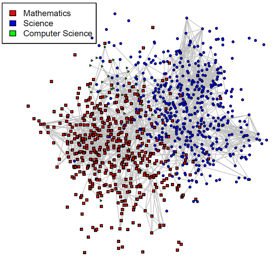
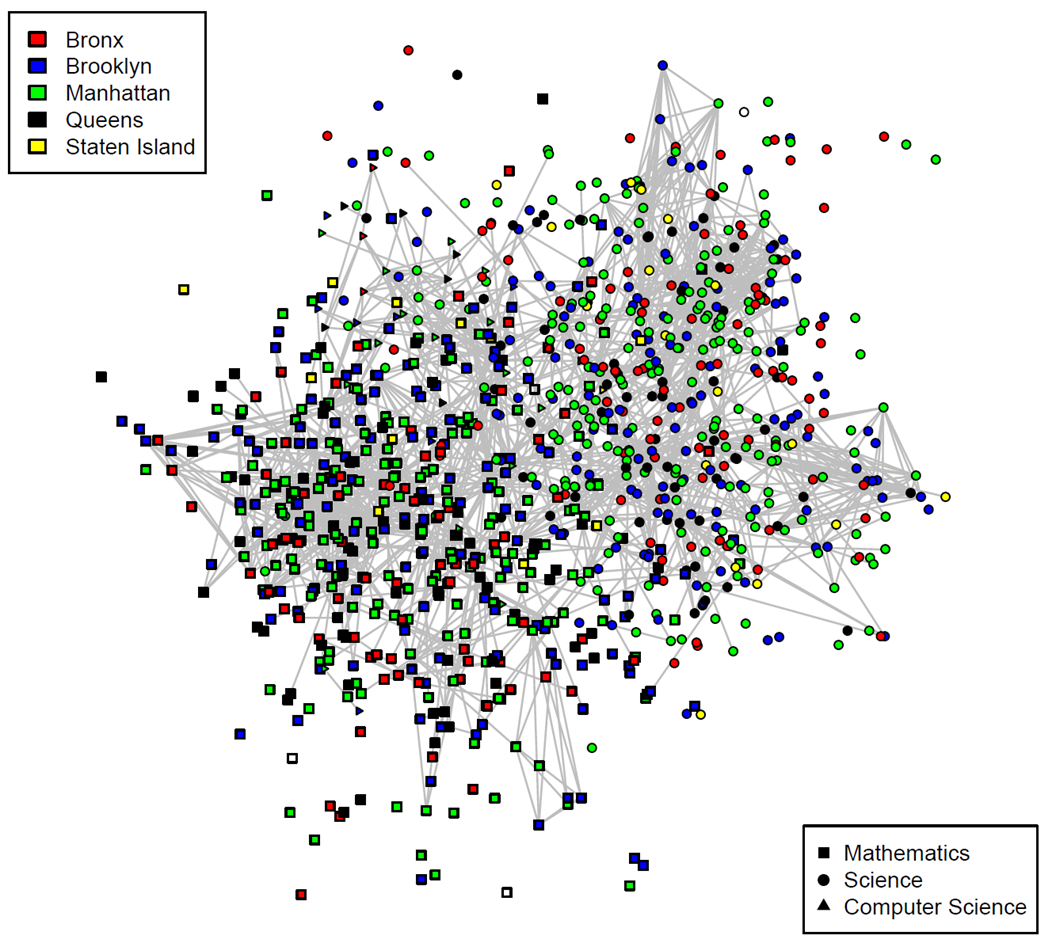
Finally, I chose to omit edges with a weight of one by defining their color as NA. That is, each edge in these graphs represents a time that a teacher saw another teacher in multiple courses, giving them a greater change of having a meaningful meeting with each other.
In the first graph, content is the lens through which I created my plot.

While the courses graphs from the first posting show that there are places where teachers of differing content get a chance to meet each other, this graph shows that, for the most part, the greater majority of teachers see other teachers who teach the same content that they do.
All things considered, this is a simple fact of life - teachers choose courses that help them teach the content that they teach - so of course they see other teachers of the same content who make, for the most part, the same decision.
A different perspective comes up when you fold in borough.

While teachers are taking courses for the most part with teachers who teach the same content as them, they are seeing a diversity of the schools that they come from. This is a greater argument for the power of a community - that great ideas can diffuse across the city of New York.
To learn more
The following links helped me think through this problem:
- Network Visualization in R by Katya Ognyanova
- Working with Bipartite/Affiliation Network Data in R by Sol Messing
- Creating a triangle for network graphs, borrowed from the
FELLApackage
Citation
@online{russell2022,
  author = {Russell, John},
  title = {A Bipartite Case (Part 2)},
  date = {2022-03-16},
  url = {https://drjohnrussell.github.io/posts/2022-03-16-bipartite-case-ii/},
  langid = {en}
}